
Homepage Framework
How we took a consumer backwards approach while aligning teams to deliver a win win solution for a dynamic homepage at Agoda
My Role
End to end research, design proposals, alignment with all consumer facing & supply teams, communicating and enforcing the framework for the entire org
Teams
Design, Product and Tech

Everyone wants to be seen on the Homepage!
All teams have their own KPIs and roadmaps. Its an age-old problem that all product companies have to tackle, and so do we!
Trigger
The easy solution couldn't be the answer anymore
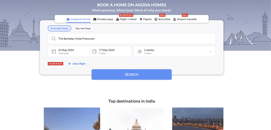
Tonnes of badges on the homepage were demanding user attention & when everything is screaming for the attention, nothing is really getting it.


Zooming out
We needed a comprehensive guide on how teams could come together to build the Agoda Homepage
SCOPE
Layout & Ordering
Everything can't be first fold. We need data backed principles that mandate the ordering of widgets on home
Demand Shaping
We need tools to enable teams to call user attention to specific areas of the UI amidst a sea of components
Visuals
Since multiple teams work on components to be added on home, their visuals often need to be aligned with each other
01
Layout & Ordering


Status Quo - cold/mess
No fixed ranking order of components on the app - also inconsistent between android and iOS
Let's analyse the impact of all these components
What's on the homepage, what are their CTRs and revenue contribution?
measure user intent
Meeting business goals
83%
Cumulative CTRs across the vertical tiles
Shortcut components
18%
Booking form retargeting
10%
Product page visit retargeting
3%
Search results page retargeting
Deals & Promotions


18%
Time sensitive deals
high intent
3%
Promotions
high ads revenue
Cross-sell

15%
Activities cross-sell
high intent
high margin
Component
CTRs
Revenue
User insights
Let’s get deeper insights from benchmarking and user interviews

Benchmarking
Common best practices and inspirations


primary action - search

continue search
*primary nudge on all platforms

last minute deals etc below the fold on most platforms
Comprehensive User Interviews
We collaborated with the research team to understand more about what the users are looking for and what they’re most receptive to on Agoda home page
5 countries
23 users
1:1 remote interviews
Card sorting exercises
?
What do users look for on the homepage?
?
How do they interact with different elements and why?
?
Do they associate the homepage with anything specific / distinctive about Agoda as a brand?
?
If they have something in mind, how do they find it on the home? How easy or difficult is it to do so?
Top Insights
The study reinforced a number of our existing understanding about users like primary navigation being important and clear & convenient search path being the go-to way to find anything. Users also placed a lot of importance on ways to bring the price down like personalised promos, deals & bank offers

Not looking for destinations discovery / ideas
Users aren't looking for discovery destinations and ideas on Agoda. Agoda usually would come in for planning.

Unattractive promotions
Users don't find the promotions on Agoda as appealing and don't really pay any attention to them while browsing

Customised recommendations based on past search
Users expect Agoda to understand them and recommend hotels and flight according to their preferences
Suggested priority order
to be moved higher up given high user intent
to be moved higher up given high user intent
Getting alignment
We took this to all stakeholders across teams - front end funnels, growth & retention
Key changes post stakeholder collaborations
1.
Prior Experiment
A past experiment showed that conversions dropped when BF was put above LTO since LTO gives urgency and drives faster bookings
Supply concern
'Limited time deals' is a partner program where properties are paying to be a part of the LTO carousel - this poses a problem if shifted below
2.
After shortlisting a property
As a pattern, after the users have shortlisted a property [went to the BF or PP], they tend to look for flights & activities so cross sell shouldn’t be so down below - should be between PP & SSR
Post booking
Flights, activities & airport cabs are the next priority - this should get more preference than all other accom related components including LTOs
Revised Order of Priority
post booking
Prior experiments &
supply concern
+ Personalisation
Evolving the homepage based on the different steps of the journey that the user is on / dropped off from
New user
SSR drop off
PP drop off
BF drop off
Post booking
Win-Win Solution

For Users
More contextual homepage
Less input to reach the desired place in the app
Quick checkout

For Business
More intuitive entry points for cross-sell & secondary funnels
Higher overall conversions
02
Demand shaping
We then came to solving for the numerous badges on home page. From a user perspective we wanted to reduce the number of badges to a minimum. I led discussions with design and product stakeholders driving towards a conclusion based on the recency of the funnels and future business goals
Negative test surplus badges
Remove the 'New' & ‘Bundle & save’ badges from the homepage
Flat impact
No drop of conversions except for when badges on transport and activities were removed
No uptick on verticals after first two badges

Going forward rule
There should be a maximum of 2 new badges on the homepage.
If any team wants to add a badge, they must discuss with the other teams to remove one of the previous badges so the total always remains 2
03
Visuals
We did a UI analysis on desktop and apps to identify inconsistencies


huge cards & old design
Different font weight & size for headers
old design components need to be migrated to the latest design system visuals


Lowercase tags instead of sentence case
Distance not present in ios
Completely different implementation in ios & android


Inconsistent header copy for promotion carousel
more padding than between
other components
Execution Plan
Since adapting the framework with all the existing problems is a longer process, we scoped it into 2 phases
Phase 1
Immediate implementation
01 - Reordering of components
02 - Remove surplus 'New' badges
03 - Migrate desktop to ADS 2.0 and fix the above issues. Fix app parity between ios & android
Desktop changes —
Left align
Smaller cards
Remove irrelevant components
Migrate to ADS 2.0

App parity —
Make all components consistent in design
Fix sentence casing in place of lowercase
Make headers consistent


Phase 2
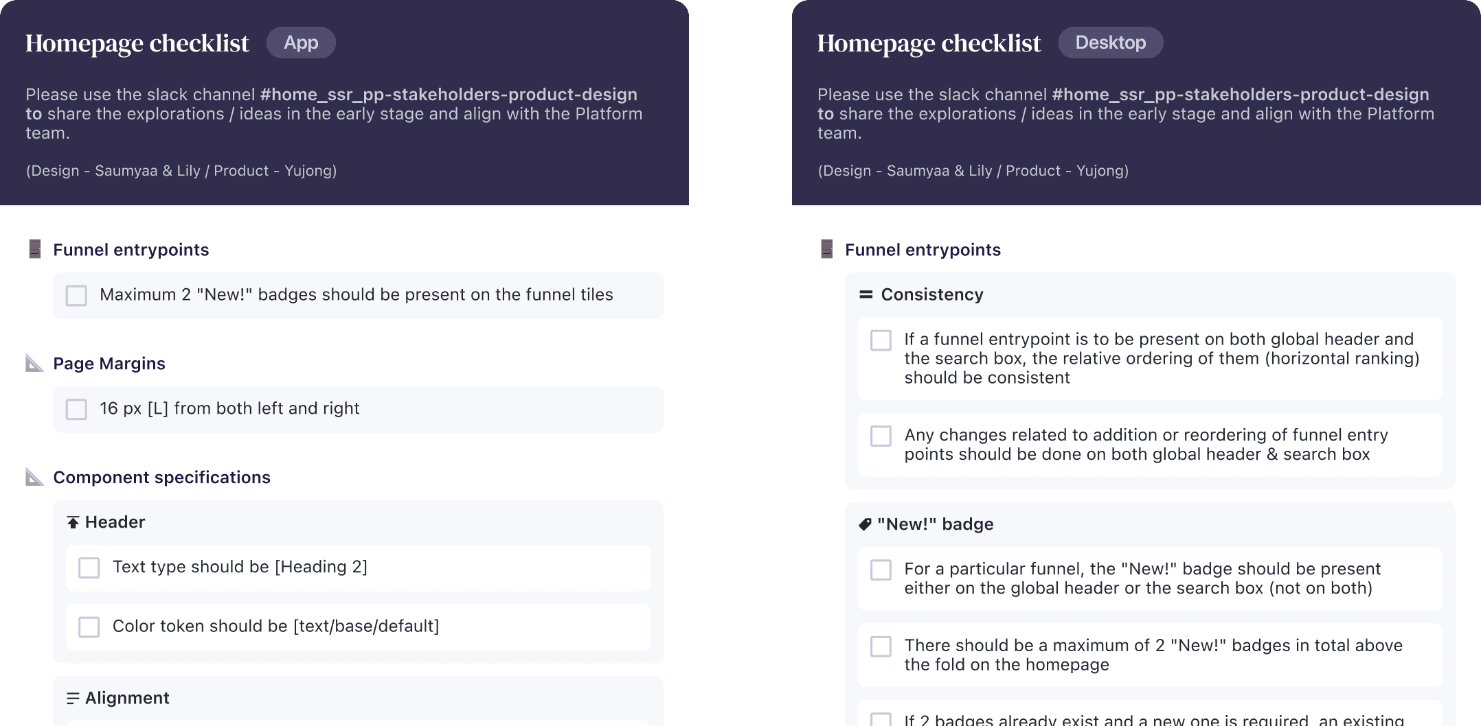
Build a framework including the UI Guidelines & Handoff Checklist
We created a checklist for both app and desktop for designers to refer to while adding / modifying anything on the homepage
The framework and guidelines are now ready.
Its time to launch! 🚀
Release plan
Got a green flag from ADS and DesOps team on the framework guidelines & the checklist to launch the framework
Presenting to all front end designers and PMs
Consumer funnels, growth & retention
Sharing with consumer devs - App & web
Consumer funnels, growth & retention
Present in design all-hands
With the entire design team, including Sr. Director of design and VP of product


Projected impact
The framework was well received by the entire team. To estimate the impact, I closely collaborated with the Design Ops team that looks after the quantitative measures of design effort, waste and cross functional collaborations.
~30%
decrease in effort and time spent while designing components for the homepage
~50%
less effort in terms of collaboration & alignment with other teams and stakeholders
